Blog Archives
Announcing a Flat Formation
At the end of a metaphorical 90 minutes (more than 20 years literally), this is what U.S. Soccer and Nike came up with:
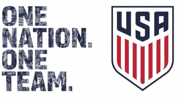
- A crest with 13 vertical stripes of red and white under a blue field is a traditional American style.
- Seven red and 6 white stripes come directly from our flag, demonstrating that the crest is rooted in the history of our nation.
- Uses the traditional field of blue to celebrate the three most important letters in the vocabulary of our fans, from stadiums to watch parties to the local bar – U.S.A.
- The colors stay true to our nation’s colors with the red and blue drawn straight from the flag.
- Notably, the new identity no longer features stars or a ball. In soccer tradition, stars are placed above the logo to represent World Cup victories. The WNT crest will prominently feature the three stars earned in 1991, 1999 and most recently, the historic 2015 victory.
(U.S. Soccer)
The new crest has uniquely American features (as listed above), yet it lacks imagination and declarative strength. This is the symbol of this burgeoning sport in America and the first impression is strikingly plain and boring.
Where is a bald eagle in striking position? The snake nobody should dare tread on?
There are countless creative design ideas that could have/should have been brainstormed for this branding endeavor.
Where is the ingenuity, that defining characteristic of soccer and this country? What does this crest convey to ourselves and our competitors? How does this new crest represent our heritage and a future of excellence?
There are 13 stripes, yes. The colors are red, white and the right shade of blue this time, yes. However, how did a design team at Nike, a company that prides itself on creativity and branding (cough cough Oregon football), submit this idea without it being April 1st? What does this crest possibly inspire for new jersey designs?
The United States of America broadly, and soccer in America specifically, has always been about a brighter tomorrow. But the new crest is a straight-forward graphic that doesn’t really tell us anything about yesterday, today or tomorrow.
U.S. Soccer desperately needs a vivid and cohesive identity on the pitch.
Flat and humdrum has already been done.
The Smack and Scold
If this were Medieval times (the era, not the restaurant), Columbus and Los Angeles would be preparing for a joust between a 20-year knight and a hotshot newcomer of the soccer kingdom.
The Columbus Crew SC, one of the first ten teams of Major League Soccer (MLS), has been defined by its colors. So much so that the club affectionately and proudly goes by the nickname, “The Black & Gold.” Their sobriquet and trademark color scheme, unique in MLS for 20 years, has exclusively distinguished Columbus and its fans from the other original 9 teams and continues to stand-out among the league’s 20 other clubs.

(Original Logo, 1996)

(New Logo, 2015)

(Nordecke, Google+)
Until now.
The 22nd club recently entered MLS: LA FC.
Just as they’ve become the second MLS team in Los Angeles (adios Chivas USA), the frustration they will receive from soccer fans in Columbus will be second to none when they visit for a soccer match in the future (except for Portland).
Why?
The LA FC group, less likely blind to reality and more likely deliberately provocative, chose black and gold as its primary colors.
![]()
“Black and Gold embody the success, glamour, and urban texture of Los Angeles.” (LA FC Online)
When thinking of Los Angeles, do you composite the colors black and gold above all others in your mind?
Anthony Precourt tweeted his reaction from the January 7th LA FC presentation.
How does the owner of Crew SC feel about this?
“Hat’s off to @LAFC. Absolutely crushed it with your new crest and colors. @MLS”
He added:
“Only one comment. Columbus Crew SC is the true Black and Gold! Maybe you roll with Gold and Black? @LAFC #CrewSC”
A tweet is one thing, but hopefully Mr. Precourt understands how important tradition and character are to this city and soccer club (the banana kits, cough cough), grows a stronger spine and makes a larger public statement alongside the club’s infectiously energetic ambassador Frankie Hejduk about Crew SC’s decorated (and checkered) history, identity and team-to-team decorum. The brazen brand management color decision made by LA FC, at its core, violates a level of sportsmanship of the beautiful game in MLS.
These are not just colors, but much more. It’s not just poor form, it’s really not cool.
The LA FC logo is fine, but the color choice unmistakably spray paints a lack of respect for its storied Midwestern counterpart. There are dozens of other color combinations they could have selected for this league, but they chose to use a stick instead of a paint brush as their illustrative tool.
LA FC should receive a warm welcome as MLS’s 22nd team. Their entrance is exciting news. However, their naive freshman status does not excuse their team of brand and marketing professionals from deliberately poking Columbus Crew SC in the eye with a stick with tips dripping in friendly shades. LA FC’s logo/crest brainstorming surely involved pictures of every team’s logo and colors with explanations of every team’s history and defining characteristics.
Color Columbus mad.
Actually, coloring just Columbus black & gold is all we want.
Flying’s Hidden Future?
Cue Frank Sinatra’s, “Come Fly With Me.”
As American airports struggle to keep up with the modern and innovative designs of its architectural counterparts in foreign nations from all around the world, it appears as if the golden era of flying from the days of Pan Am and sophistication at 35,000 feet could be the creative source for a 21st century return to luxury in the skies.
Well, at least for the space where we wait to get on the plane.
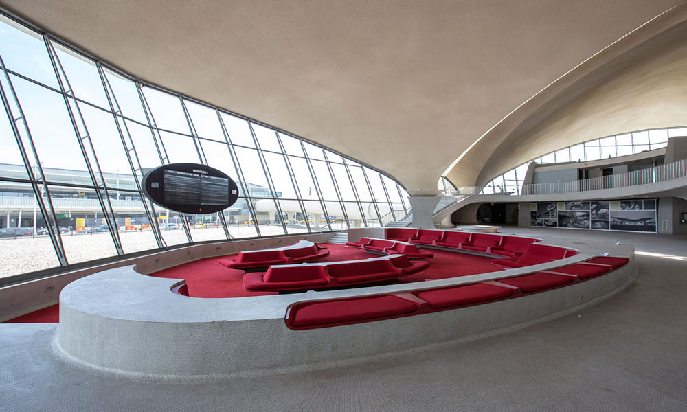
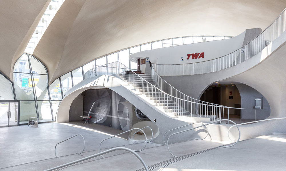
It’s time to experience a hidden, closed-off terminal of JFK Airport in New York City.

(Photo by Max Touhey)
(Photo by Max Touhey)

(Photo by Max Touhey)
(Photo by Max Touhey)

(Photo by Max Touhey)
The seats are spacious and the layout is visually appealing. The lines (interior and exterior) are cool with nice dimension and the vibe is simplistically calming. More splashes of sharp colors should be added, along with more backs to seats and the area should be gadget-friendly with the latest technological features, but the basic framework is there. Even in its current form, it’s a welcomed call back to the moment in American history when flying wasn’t inherently stressful or a tornado of chaos, rudeness and sloppiness. Just the sight of this environment inspires class and a promise of a great journey and exciting escape.
Unfortunately, this gem from the past is set to be re-purposed into a fancy hotel. That’s not surprising. But going to a terminal in an airport like the one shown above in a happy mood and not trying to merely complete the taxing task of going from Point A to Point B (with layovers in Point C and D) would be rejuvenating.
It would be a smooth, worldly ride, if you will.
