Announcing a Flat Formation
At the end of a metaphorical 90 minutes (more than 20 years literally), this is what U.S. Soccer and Nike came up with:
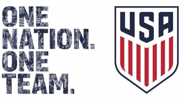
- A crest with 13 vertical stripes of red and white under a blue field is a traditional American style.
- Seven red and 6 white stripes come directly from our flag, demonstrating that the crest is rooted in the history of our nation.
- Uses the traditional field of blue to celebrate the three most important letters in the vocabulary of our fans, from stadiums to watch parties to the local bar – U.S.A.
- The colors stay true to our nation’s colors with the red and blue drawn straight from the flag.
- Notably, the new identity no longer features stars or a ball. In soccer tradition, stars are placed above the logo to represent World Cup victories. The WNT crest will prominently feature the three stars earned in 1991, 1999 and most recently, the historic 2015 victory.
(U.S. Soccer)
The new crest has uniquely American features (as listed above), yet it lacks imagination and declarative strength. This is the symbol of this burgeoning sport in America and the first impression is strikingly plain and boring.
Where is a bald eagle in striking position? The snake nobody should dare tread on?
There are countless creative design ideas that could have/should have been brainstormed for this branding endeavor.
Where is the ingenuity, that defining characteristic of soccer and this country? What does this crest convey to ourselves and our competitors? How does this new crest represent our heritage and a future of excellence?
There are 13 stripes, yes. The colors are red, white and the right shade of blue this time, yes. However, how did a design team at Nike, a company that prides itself on creativity and branding (cough cough Oregon football), submit this idea without it being April 1st? What does this crest possibly inspire for new jersey designs?
The United States of America broadly, and soccer in America specifically, has always been about a brighter tomorrow. But the new crest is a straight-forward graphic that doesn’t really tell us anything about yesterday, today or tomorrow.
U.S. Soccer desperately needs a vivid and cohesive identity on the pitch.
Flat and humdrum has already been done.
Posted on March 1, 2016, in Uncategorized and tagged branding, design, Nike, soccer, sports, U.S. soccer. Bookmark the permalink. Leave a comment.

Leave a comment
Comments 0