Blog Archives
From Sea to (Shining) Sea
America’s shining, beautiful soccer jersey?
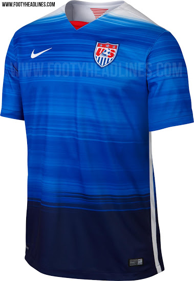
The 2015 away kits have been revealed for the USMNT and USWNT. The human Bomb Pops appear to have finally melted away its final steady defender (sort of like the real USMNT) in favor of a jersey that features shades of blue, blue and blue.
The above design is virtually the exact same for both the USMNT and USWNT, with the primary exception of the two World Cup stars for the women. Also, the design is the same on the front and the back. Considering the fact that the shade of blue closest to the one stitched on the American flag is the darker portion at the bottom, that seems like a really peculiar miss for Nike. By the way, did Nike run out of the color red or is that going to be more prominently featured in a new home jersey? It’s kind of a great color. After all, the U.S. is the red, white and blue.
Speaking of which, what was wrong with the “Where’s Waldo?” jersey?
As has been mentioned on this blog before (as starting points), the collar should be blue to represent a gritty, relentless blue collar work ethic with a jersey design that is sharp to symbolize a cool and innovative white collar style of play. This would encapsulate the spirit and identity of America and its daring declaration of independence, from its inception in 1776 through today and into the future.
The new jersey is better than the Bomb Pops, but it looks like a training shirt. When the designers and the brightest minds at Nike Soccer have the American flag, its beautiful combination of colors, our nation’s history (soccer and non-soccer) and lots of time, it’s a sincere mystery how this becomes the final product.
Perhaps I’m being too harsh, except I don’t think I am. It may look a little better on the field with names and numbers, but it still begs the question of what the design could (and should) have been.
Most of all, I wish American ingenuity had been a component for this new soccer jersey.
Golfing in Brazil
4 years ago, the Americans paraded around South Africa in a beauty pageant sash. This year, it’s a golf shirt/polo shirt (whichever you prefer). I want to offer a special congratulations to the entire Creative Department for the USMNT Soccer Jerseys and Uniforms at Nike for (again) successfully implementing that rare business plan centered on the premise of designing bland/unimaginative/terrible-looking jerseys that will sell like the complete opposite of something that sells like crazy.
With the biggest window for American commerce to soccer (which only presents itself every 4 years, mind you), Nike has again managed to design the most confusingly bizarre, plain-looking jerseys with the best colors and creative opportunities at their fingertips in red, white and blue, coupled with America’s amazingly inspiring history.
Nike has the vivid colors of red and blue at their disposal and they chose all white. The jerseys don’t need to be loud, but there are infinite possibilities regarding attractive color combinations and sharp designs for a quintessential American look that projects belief, talent and relentless heart (the collar should, without question, be blue by the way).
Is this uniform supposed to symbolize the vanilla and often predictable and mundane ball movement of the USMNT players on the field? If so, then maybe this uniform works.
Where is the creativity from the red and white striped-“Waldo” jerseys?
The premiere of the 2014 World Cup jerseys/uniforms for the United States could not have demonstrated less creativity or fewer instances of inspiring imagination on the part of Nike.
Interestingly, Nike has proven that simplicity can certainly work (see the new oranje Dutch 2014 World Cup jersey/uniform), but it has also proven the opposite (see the American 2014 World Cup jersey/uniform).
Nike had 4 years…4 years. It’s almost unbelievable.
Usually the terms “cash cow” and “soccer” don’t joyfully collide in the United States…and sadly, after this recent jersey/uniform reveal, they still won’t.
Yes, heat will be at least some issue and white is the best color to combat heat. But that’s no excuse for what Nike ultimately and willfully designed. Plus, the heat will not be the determining factor for the USMNT in Brazil. It just won’t. A darker jersey will not prevent them or be the deciding reason for why the USMNT may not progress out of their very difficult group.
Where’s Waldo?
Hopefully in Brazil this summer!
P.S. I had a jersey idea about a year and a half ago…

