The Checks (and Balance?) of Precision Craftsmanship
“Columbus Crew SC will live stream a historic club jersey partnership announcement on Facebook Live on Friday, February 24, at 11:30 a.m. ET in a press conference held at MAPFRE Stadium.”
–Crew SC Communications
First, the Owner/Chairman of Columbus Crew SC and MAPFRE Stadium, Anthony Precourt, cleverly teased “Fresh bananas arriving soon” in his Twitter account back on February 10th. Second, the Crew SC Communications team promises “a historic club jersey partnership.”
Bottom line: This better be good for Columbus Crew Crew SC fans.
Specifically regarding jerseys, Mr. Precourt and Co. have a mixed record. While he and his team designed a fantastic black checkered kit with a great local partner (Barbasol), the same corporate team also (purposefully, if you can believe it) chose to inject the colors from the little known Columbus, OH flag (I barely know it and I was born and raised in Columbus, OH) for a genuinely atrocious soccer kit. To add insult to injury, the team had horrible performances while wearing their Minion kits. Talk about poetic justice.
The Good

And That Time When Ugly Called Something Else Ugly
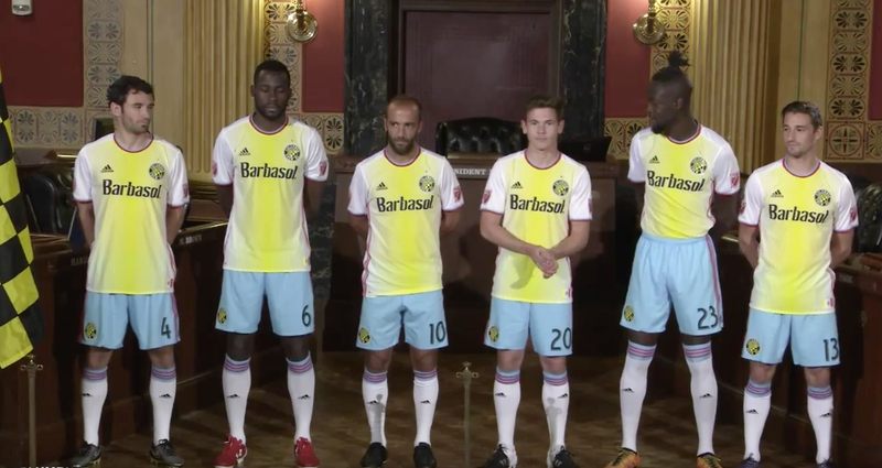
(Look at their faces!)
As the Joker would say: “And here we GO…”

The black checkered jersey (seen above) will remain the same, except with the new Acura logo/sponsorship.
At first glance, the v-neck is fine, the State of Ohio flag is a nice addition and the Charter Member #01 is a cool, subtle statement. The new Acura sponsorship is fine (a local connection), but Barbasol was also a worthy local sponsor. Time will tell to see what advertising and marketing campaigns Mr. Precourt and Co. have in mind for promoting Acura as being synonymous with Crew SC specifically and the city of Columbus, OH more broadly.
Acura’s slogan is, “Precision Crafted Performance.” After last season and the 2015 MLS Cup Final, Crew SC was smart to adopt this corporate slogan…and hopefully as a coaching strategy?
Returning back to the new 2017 kits, for some reason, the black and gold checkered pattern is tripping me up because while it’s a great design (I actually won an award for using that precise color scheme and design for/inside a headline in my high school’s yearbook), the placement seems…awkward. It’s unclear at the moment as to whether the checkered pattern’s placement balances the rest of the jersey, kit and complementary design elements.
Still, kudos for incorporating the checkered pattern into Crew SC’s famous “banana kits.” However, until the full kit (shorts and socks) are revealed, the verdict on the 2017 “banana kits” will remain TBD. The fact that Mr. Precourt and Co. prioritized telling Crew SC’s story through its jersey design does deserve high marks.
Now it’s time to play better soccer on the pitch, trade for Mix Diskerud (among many other necessary personnel changes) and for Mr. Precourt to grow a spine and declare to Los Angeles Football Club that the colors black & gold are officially the MLS property of THE Crew SC.
After all, as he and his team declared with their new 2017 kits, Columbus Crew SC is Charter Member #01.
We’ll discover soon if that truth actually means anything to the front office of Crew SC.
Posted on February 24, 2017, in Uncategorized and tagged Columbus Crew, creativity, Crew SC, design, new jersey, soccer, sports, storytelling. Bookmark the permalink. Leave a comment.

Leave a comment
Comments 0